3. Python for Fundamental Analysis: Analyze Profitability Ratios with Python
Welcome back to our Python for Finance series! In the previous post (Post 2), we successfully automated the retrieval of the three core financial statements – the Income Statement, Balance Sheet, and Cash Flow Statement – using Python and the Financial Modeling Prep (FMP) API. We saw how pandas helps structure this data effectively. But raw financial statements, while informative, are just the beginning. Their true power is unlocked when we use them to calculate key financial ratios.
Ratios help us standardize financial data, allowing for meaningful comparisons over time and between companies. They distill complex information into digestible metrics that reveal insights into a company’s performance, efficiency, and financial health.
In this post, we’ll leverage the quarterly Income Statement data we fetched and dive into calculating and visualizing some of the most important Profitability Ratios. We’ll focus specifically on Gross Profit Margin, Operating Profit Margin, and Net Profit Margin over the last 10 quarters to understand recent performance trends. Visualizing these trends with Python’s matplotlib library will make the analysis even more intuitive.
Understanding Profitability Ratios
Profitability ratios measure a company’s ability to generate earnings relative to its revenue, operating costs, balance sheet assets, or shareholders’ equity over time. They are crucial indicators of how efficiently a company uses its resources to produce profit and value for shareholders. We’ll focus on three key margins derived from the Income Statement:
1. Gross Profit Margin
- What it is: Measures profit after deducting the direct costs of producing goods/services (Cost of Goods Sold – COGS). Reflects core product profitability.
- Why it’s important: Indicates production efficiency and pricing power. Higher is generally better. Tracks effectiveness of managing production costs.
2. Operating Profit Margin (Operating Margin)
- What it is: Measures profitability after deducting COGS and operating expenses (SG&A, R&D). Reflects core business operations profitability (often linked to EBIT).
- Why it’s important: Shows operational efficiency and management effectiveness in controlling day-to-day costs.
3. Net Profit Margin
- What it is: The “bottom line” margin. Measures the percentage of revenue remaining as net income after allexpenses (COGS, operating, interest, taxes).
- Why it’s important: Represents final profit per dollar of revenue, reflecting overall efficiency and impact of leverage and taxes.
Analyzing these three margins together provides a layered view of profitability. Tracking them quarterly helps spot recent trends.
Python Implementation: Calculating and Visualizing Margins
Let’s use Python, pandas, and matplotlib to fetch the last 10 quarters of Income Statement data via the FMP API, calculate these margins, and visualize the trends.
API Key & Libraries: You’ll need your FMP API key (the code uses a placeholder but ideally load from environment variables as shown in the comments) and the necessary libraries (pip install pandas requests matplotlib). FMP offers a free plan with up to 200 calls per day.
import requests
import pandas as pd
import matplotlib.pyplot as plt
import os # Although key is hardcoded below, keeping os import is good practice

# --- Configuration ---
# API Key from fmp
API_KEY = "your_Api_key"
# Ticker symbol of the company to analyze
TICKER = "AAPL"
# Number of past quarters to retrieve
LIMIT = 10
# Base URL for FMP API version 3
BASE_URL = "https://financialmodelingprep.com/api/v3"

# --- Function to Fetch Data from FMP API ---
# Reusing the function from the previous post
def get_financial_data(url):
    """
    Fetches data from the specified Financial Modeling Prep API endpoint.
    Designed to handle endpoints that return a list of records.

    Args:
        url (str): The API endpoint URL.

    Returns:
        list or None: A list of dictionaries containing the fetched data if successful,
                      otherwise None.
    """
    print(f"Attempting to fetch data from: {url}")
    try:
        response = requests.get(url, timeout=15)
        response.raise_for_status() # Check for HTTP errors
        data = response.json()
        if isinstance(data, list):
            if len(data) > 0:
                print(f"Successfully fetched {len(data)} periods of data.")
                return data
            else:
                print(f"Warning: Received empty list from {url}.")
                return None
        elif isinstance(data, dict) and 'Error Message' in data:
             print(f"Error from API at {url}: {data['Error Message']}")
             return None
        else:
            print(f"Warning: Received unexpected data format from {url}. Type: {type(data)}")
            return None
    except requests.exceptions.RequestException as e:
        print(f"Error fetching data from {url}: {e}")
        return None
    except requests.exceptions.JSONDecodeError as e:
        print(f"Error decoding JSON response from {url}: {e}\nResponse text: {response.text}")
        return None
    except Exception as e:
        print(f"An unexpected error occurred while fetching {url}: {e}")
        return None

# --- Main Execution Logic ---
if __name__ == "__main__":
    print(f"\n--- Calculating Profitability Ratios for {TICKER} ({LIMIT} Quarters) ---")

    # Construct the URL for the quarterly income statement
    income_url = f"{BASE_URL}/income-statement/{TICKER}?period=quarter&limit={LIMIT}&apikey={API_KEY}"

    # Fetch the income statement data
    income_data = get_financial_data(income_url)

    if income_data:
        # Convert the list of dictionaries to a pandas DataFrame
        df = pd.DataFrame(income_data)
        print(f"\nDataFrame created with shape: {df.shape}")

        # --- Data Cleaning and Preparation ---
        # Select relevant columns
        required_cols = ['date', 'revenue', 'grossProfit', 'operatingIncome', 'netIncome']
        if not all(col in df.columns for col in required_cols):
            print(f"Error: DataFrame is missing one or more required columns: {required_cols}")
            missing = [col for col in required_cols if col not in df.columns]
            print(f"Missing columns: {missing}")
        else:
            # Convert financial columns to numeric, coercing errors to NaN
            numeric_cols = ['revenue', 'grossProfit', 'operatingIncome', 'netIncome']
            for col in numeric_cols:
                df[col] = pd.to_numeric(df[col], errors='coerce')

            # Drop rows with NaN values in essential numeric columns
            initial_rows = len(df)
            df.dropna(subset=numeric_cols, inplace=True)
            rows_after_dropna = len(df)
            if initial_rows > rows_after_dropna:
                 print(f"Dropped {initial_rows - rows_after_dropna} rows due to missing numeric data.")


            if not df.empty:
                # Convert 'date' column to datetime objects
                df['date'] = pd.to_datetime(df['date'])
                # Sort DataFrame by date in ascending order (oldest to newest) for plotting
                df.sort_values(by='date', ascending=True, inplace=True)
                # Reset index after sorting if needed (optional)
                # df.reset_index(drop=True, inplace=True)

                # --- Calculate Profitability Ratios ---
                # Avoid division by zero if revenue is 0
                df['Gross Profit Margin (%)'] = df.apply(lambda row: (row['grossProfit'] / row['revenue']) * 100 if row['revenue'] != 0 else 0, axis=1)
                df['Operating Profit Margin (%)'] = df.apply(lambda row: (row['operatingIncome'] / row['revenue']) * 100 if row['revenue'] != 0 else 0, axis=1)
                df['Net Profit Margin (%)'] = df.apply(lambda row: (row['netIncome'] / row['revenue']) * 100 if row['revenue'] != 0 else 0, axis=1)

                print("\n--- Calculated Profitability Ratios (Last 10 Quarters) ---")
                # Display relevant columns: date and the calculated margins
                print(df[['date', 'Gross Profit Margin (%)', 'Operating Profit Margin (%)', 'Net Profit Margin (%)']].round(2)) # Round for display

                # --- Visualization ---
                print("\n--- Generating Plot ---")
                plt.figure(figsize=(12, 7)) # Adjusted figure size slightly

                # Plot each margin against the date
                plt.plot(df['date'], df['Gross Profit Margin (%)'], label='Gross Profit Margin', marker='o')
                plt.plot(df['date'], df['Operating Profit Margin (%)'], label='Operating Profit Margin', marker='s') # Different marker
                plt.plot(df['date'], df['Net Profit Margin (%)'], label='Net Profit Margin', marker='^') # Different marker

                # Add titles and labels
                plt.title(f'{TICKER} Quarterly Profitability Margins (Last {len(df)} Quarters)')
                plt.xlabel('Date (Quarter End)')
                plt.ylabel('Profit Margin (%)')

                # Add legend, grid, and rotate x-axis labels
                plt.legend()
                plt.grid(True, linestyle='--', alpha=0.6) # Added linestyle and alpha
                plt.xticks(rotation=45, ha='right') # Adjusted rotation anchor

                # Improve layout and display the plot
                plt.tight_layout()
                plt.show()

            else:
                 print("\nDataFrame is empty after cleaning. Cannot calculate ratios or plot.")

    else:
        print("\nFailed to fetch Income Statement data. Cannot calculate ratios.")

    print("\n--- Script Finished ---")
Code Explanation: Step-by-Step
- Import Libraries: Imports
requests,pandas,matplotlib.pyplot, andos. - Configuration: Sets the
API_KEY(using your api key from FMP),TICKER,LIMIT(to 10 quarters), andBASE_URL. get_financial_data(url)Function: fetch the data list from the FMP API, handling common errors.- Fetch Income Statement Data (Main Block):
- The main
if __name__ == "__main__":block controls execution. - It constructs the
income_urlspecifically for the quarterly income statement endpoint (/income-statement/), including thelimit=10parameter. - It calls
get_financial_datato retrieve the list of quarterly income statement dictionaries.
- The main
- Data Processing and Ratio Calculation:
- Check & DataFrame: Checks if
income_datawas successfully fetched. If yes, converts it into apandasDataFrame (df). - Column Check: Crucially, it first verifies that all required columns (
date,revenue,grossProfit,operatingIncome,netIncome) are present in the DataFrame received from the API. If not, it prints an error and stops processing that DataFrame. - Convert to Numeric: It iterates through the essential financial columns and converts them to numeric types using
pd.to_numeric(errors='coerce'). This handles cases where the API might return numbers as strings and turns any non-convertible values intoNaN. - Handle Missing Data: It uses
df.dropna(subset=numeric_cols, inplace=True)to remove entire rows (quarters) where any of the essentialnumeric_colscontainNaN. This ensures calculations won’t fail due to missing data. It reports how many rows were dropped. - Date Conversion & Sorting: If the DataFrame isn’t empty after cleaning, it converts the
datecolumn into proper datetime objects (pd.to_datetime) and sorts the DataFrame chronologically usingdf.sort_values(). - Calculate Ratios: It calculates the three profit margins. The code uses
df.apply()with alambdafunction, which is a safe way to perform row-wise calculations and includes a check (if row['revenue'] != 0 else 0) to prevent division-by-zero errors if revenue happens to be zero in any quarter. Results are stored in new DataFrame columns. - Display Ratios: Prints the relevant columns (
dateand the three calculated margins) from the DataFrame, rounded to two decimal places, using.to_string()for better console display.
- Check & DataFrame: Checks if
- Visualization:
- Check for Data: Ensures the DataFrame has data before attempting to plot.
- Create Plot: Uses
matplotlib.pyplot(plt):- Sets figure size (
plt.figure). - Plots each margin against the
dateusingplt.plot(). Differentmarkerstyles ('o','s','^') are used for better line differentiation. - Sets the title dynamically based on the ticker and number of quarters plotted (
len(df)). - Sets x and y axis labels.
- Adds a legend, a styled grid (
linestyle='--', alpha=0.6), rotates x-axis date labels (plt.xticks), and optionally sets the y-axis minimum (plt.ylim). - Uses
plt.tight_layout()for better spacing andplt.show()to display the plot window.
- Sets figure size (
- Error Handling: Includes checks for failed API fetch and the case where the DataFrame becomes empty after the cleaning (
dropna) step.
Interpreting the Visualized Results
Let’s apply these interpretation ideas to the example chart generated by our script for Apple (AAPL) over the 10 quarters leading up to early 2025:
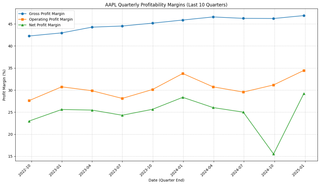
- Gross Profit Margin (Blue Line): We observe a clear and steady upward trend, rising from around 42.5% to approximately 47%. This suggests Apple consistently improved its core profitability from selling its products/services over this period, perhaps due to better cost management in production (COGS) or strong pricing power.
- Operating Profit Margin (Orange Line): This margin also shows an overall upward trend, starting near 27.5% and ending near 34%, indicating improving operational efficiency. However, it exhibits more volatility than the gross margin, with noticeable dips around mid-2023 and mid-2024 before recovering. The relatively large, consistent gap between the Gross and Operating margins (roughly 13-15 percentage points) highlights the significant investment Apple makes in operating expenses like R&D and SG&A relative to its direct cost of goods.
- Net Profit Margin (Green Line): Following a similar, albeit more volatile, path to the operating margin, the net margin generally trended upwards from ~23% towards ~29%. The most striking feature is the sharp V-shaped dip in the late 2024 quarter (down to ~15.5%) followed by a rapid recovery to a new high in early 2025. While the overall trend is positive, this specific dip would prompt further investigation in a real analysis – was it due to a one-off expense, a change in tax rate, higher interest costs, or something else impacting the bottom line disproportionately in that single quarter? The relatively smaller gap between Operating and Net margins (usually 4-6 percentage points, except for the dip) suggests the impact of interest and taxes is generally less significant than operating expenses for Apple.
Takeaway: The visualization instantly reveals that while Apple’s core product profitability (Gross Margin) steadily improved, its overall operational and net profitability experienced more fluctuations, with a particularly unusual event impacting the net margin in late 2024. This visual analysis quickly directs our attention to specific periods and factors needing further fundamental investigation.
Wrapping Up
We’ve successfully moved from simply retrieving financial statements to calculating key profitability ratios and, importantly, visualizing their trends over time. Using `pandas` for calculation and `matplotlib` for plotting allows us to quickly assess a company’s recent profitability performance and identify potential strengths or weaknesses. Visualizations make these trends much easier to grasp than just looking at tables of numbers.
This ability to programmatically calculate and visualize ratios is a fundamental skill in applying Python to financial analysis.
Having examined profitability, we’ll turn our attention to a company’s short-term financial health in the next official post (Post 3). We will focus on Analyzing Liquidity with Python, calculating the Current Ratio and Quick Ratio using the Balance Sheet data. Stay tuned!
Disclaimer: This blog post is for educational purposes only. Financial data APIs provide data “as is”; always verify critical data from official sources (e.g., SEC filings) before making investment decisions. Ensure compliance with API provider terms of service. this post was drafted with help of AI and reviewed and changed by the author.