3. Understanding MACD with Python
Welcome back to our series on Python for Technical Indicators! After covering Moving Averages and the Relative Strength Index (RSI), we’ll now explore another popular momentum indicator: Moving Average Convergence Divergence (MACD).
Moving Average Convergence Divergence (MACD) is a popular trend-following momentum indicator. It gets its name because it tracks the relationship between a faster and a slower Exponential Moving Average (EMA) of an asset’s price, showing when these two averages converge (move closer) or diverge (move apart). By analyzing this relationship, traders use MACD to gauge the strength and direction of a trend and identify potential buy or sell signals as momentum shifts.
In this article, we learn how to calculate and visualize the MACD indicator for Apple (AAPL) stock data.
Step 1: Setting Up Python
First, ensure you have the necessary libraries installed. If not, use pip: pip install pandas matplotlib yfinance. Now, let’s import them into our Python script:
# Import libraries
import yfinance as yf
import pandas as pd
import matplotlib.pyplot as plt
Step 2: Getting the Stock Data
We’ll use yfinance to download historical daily data for Apple (AAPL). Let’s grab data for the past year.
# Define the ticker symbol
ticker = 'AAPL'

# Download historical data
# Using period="1y" for one year of data
data = yf.download(ticker, period="1y")

# Display the first few rows to check
print(f"Downloaded {ticker} data:")
print(data.head())
This fetches the Open, High, Low, Close, Adjusted Close, and Volume data for AAPL into a Pandas DataFrame. We’ll primarily use the ‘Close’ price for MACD calculation.
Step 3: Calculating MACD
The MACD indicator has three main components:
- MACD Line: The difference between a short-term EMA (typically 12 periods) and a long-term EMA (typically 26 periods).
MACD Line = EMA(12) - EMA(26) - Signal Line: An EMA (typically 9 periods) of the MACD Line itself.
Signal Line = EMA(9) of MACD Line - MACD Histogram: The difference between the MACD Line and the Signal Line.
Histogram = MACD Line - Signal Line
Let’s calculate these using Pandas:
# Calculate the Short-term EMA (12 periods)
ema_12 = data['Close'].ewm(span=12, adjust=False).mean()

# Calculate the Long-term EMA (26 periods)
ema_26 = data['Close'].ewm(span=26, adjust=False).mean()

# Calculate the MACD Line
macd_line = ema_12 - ema_26

# Calculate the Signal Line (9-period EMA of MACD Line)
signal_line = macd_line.ewm(span=9, adjust=False).mean()

# Calculate the MACD Histogram
macd_histogram = macd_line - signal_line

# Add MACD components to the DataFrame
data['MACD_Line'] = macd_line
data['Signal_Line'] = signal_line
data['MACD_Histogram'] = macd_histogram

# Display the last few rows with MACD values
print("\nData with MACD calculations:")
print(data.tail())
.ewm(span=N, adjust=False).mean()calculates the Exponential Moving Average.spancorresponds to the period (like 12, 26, or 9).adjust=Falseis commonly used in technical analysis calculations for EMA.- We then calculate the
macd_line,signal_line, andmacd_histogrambased on their definitions. - Finally, we add these new columns to our original DataFrame.
Step 4: Visualizing MACD
It’s standard practice to plot the MACD indicator in a separate panel below the price chart. We can use Matplotlib’s subplots for this.
# Create a figure and a set of subplots
# We need 2 subplots: one for price, one for MACD
fig, (ax1, ax2) = plt.subplots(2, 1, figsize=(12, 8), sharex=True) # sharex=True links the x-axis

# Plot 1: Price Data
ax1.plot(data.index, data['Close'], label='AAPL Close Price', color='blue')
ax1.set_title(f'{ticker} Close Price')
ax1.set_ylabel('Price ($)')
ax1.legend()
ax1.grid(True)

# Plot 2: MACD Data
ax2.plot(data.index, data['MACD_Line'], label='MACD Line', color='orange')
ax2.plot(data.index, data['Signal_Line'], label='Signal Line', color='purple', linestyle='--')
# Plot the histogram as a bar chart
ax2.bar(data.index, data['MACD_Histogram'], label='MACD Histogram', color=data['MACD_Histogram'].apply(lambda x: 'g' if x >= 0 else 'r'), alpha=0.6)

ax2.set_title('MACD Indicator')
ax2.set_ylabel('Value')
ax2.set_xlabel('Date')
ax2.legend()
ax2.grid(True)
ax2.axhline(0, color='grey', linestyle='-', linewidth=0.5) # Add zero line for reference

# Improve layout and display the plot
plt.tight_layout()
plt.show()
plt.subplots(2, 1, ...)creates a figure with 2 rows and 1 column of plots (ax1,ax2).sharex=Trueensures both plots share the same date axis.ax1plots the closing price.ax2plots the MACD Line, Signal Line, and the Histogram. We use a bar chart for the histogram and color the bars green (positive) or red (negative).axhline(0, ...)adds a horizontal line at zero on the MACD plot, which is a key reference level.plt.tight_layout()adjusts spacing, andplt.show()displays the chart.
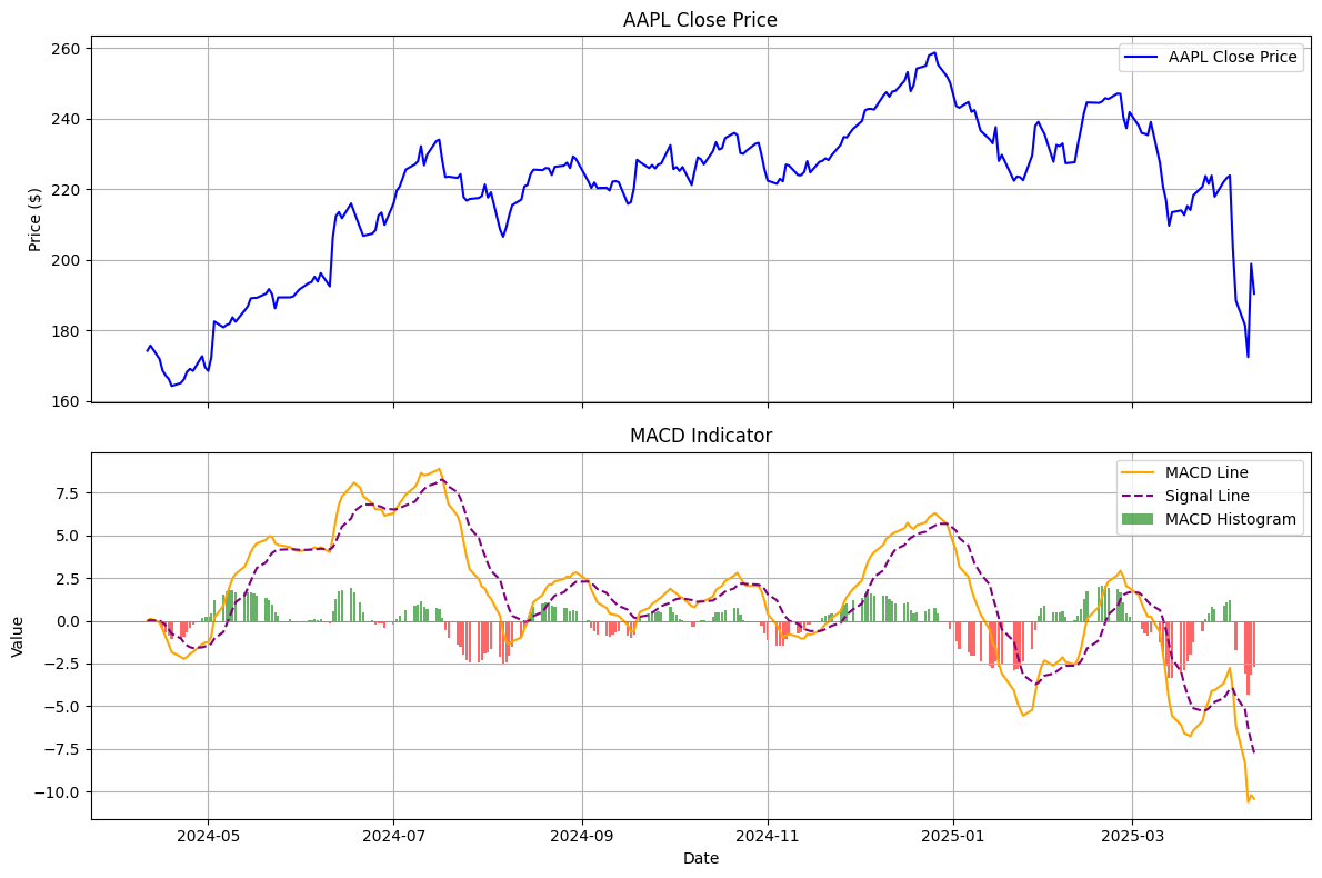
Step 5: Basic Interpretation of the output plot
- Reading the Plots: The top plot shows the stock price (AAPL, blue line). The bottom plot shows the MACD Line (orange), its 9-day EMA (Signal Line, purple dashed), and the Histogram (green/red bars).
- MACD/Signal Crossovers: These are key signals.
- Bullish Crossover: When the orange MACD Line crosses above the purple Signal Line, it suggests potential upward momentum. This often corresponds with the histogram turning green. Look at periods like May 2024 and Nov 2024 in the example chart.
- Bearish Crossover: When the orange MACD Line crosses below the purple Signal Line, it suggests potential downward momentum. The histogram typically turns red. Examples include late July/Aug 2024 and mid-Jan 2025.
- Zero Line Crossovers: When the MACD Line (orange) crosses the horizontal zero line, it indicates the overall momentum shifting.
- Crossing above zero suggests the 12-day EMA is now higher than the 26-day EMA (even though EMAs aren’t plotted on the top chart in this version), a sign of potentially strengthening upward trend.
- Crossing below zero suggests the 12-day EMA has dropped below the 26-day EMA, indicating a potentially strengthening downward trend. In the example, the MACD is below zero towards the end (April 2025), indicating recent bearish momentum.
- Histogram: The bars represent the difference between the MACD and Signal lines.
- Growing green bars suggest increasing bullish momentum.
- Shrinking green bars suggest waning bullish momentum.
- Growing red bars (extending further below zero) suggest increasing bearish momentum.
- Shrinking red bars suggest waning bearish momentum.
- Divergence (Advanced): Sometimes, the price might make a new high while the MACD line makes a lower high (bearish divergence), or the price makes a new low while MACD makes a higher low (bullish divergence). These can be potential reversal signals but require careful analysis.
Remember, MACD is just one tool. Signals should ideally be confirmed with other indicators or analysis techniques before making trading decisions.
Conclusion and next steps
We’ve successfully fetched stock data, calculated the MACD indicator (including its line, signal line, and histogram), and visualized it alongside the price using Python. MACD is a versatile tool for gauging trend direction and momentum.
- Explore different parameters for the EMAs (e.g., 5, 35, 5 for faster signals).
- Combine MACD signals with other indicators (like RSI or Moving Averages) for more robust analysis.
- Backtest trading strategies based on MACD signals.
Stay tuned for the next indicator in our Python series.
Disclaimer: The content provided in this article is for informational and educational purposes only. It does not constitute financial advice, investment advice, trading advice, or any other sort of advice, and you should not treat any of the article’s content as such. Always conduct your own research and consult with a qualified financial advisor before making any investment decisions.
Note: This article was drafted with the assistance of AI technology and has been reviewed and edited by the author.