The Hook: When Your Coffee Bill Becomes a Crime Scene
Last Tuesday, I walked into my usual coffee shop and nearly choked—not on the espresso, but on the price. My regular medium latte had jumped from $3.75 to $5.25 compared to a few months back. Five dollars and twenty-five cents! For coffee!
Standing there, clutching my overpriced caffeine lifeline, a question hit me: Are prices really going up everywhere, or am I just noticing the dramatic ones? What’s the real story behind those scary “inflation at X%” headlines that flash across my news feed like economic ambulance sirens?
That’s when I decided to go beyond the headlines and the hot takes. My mission: to become a CPI detective. My secret weapon? Not a magnifying glass, but my trusty laptop and the power of Python.
Decoding the Lingo: Meet the Characters in Our Inflation Drama
Before I could crack this case, I needed to understand the Consumer Price Index—the CPI .Think of it as a giant shopping cart representing the entire national economy. Every month, the Bureau of Labor Statistics tracks the cost of this metaphorical cart filled with everything from housing and transportation to that overpriced latte that started this whole investigation.
But here’s where it gets interesting: there are actually two main characters in our inflation story, and they have very different personalities.
- Headline CPI is like looking at your entire monthly spending—everything, including that one-time $200 concert ticket and the week you had to fill up your gas tank three times because of a road trip. It tells you the total “ouch factor” but includes all the drama.
- Core CPI is your more predictable, recurring spending . It’s the Netflix subscription, the rent, the monthly haircut. The Federal Reserve and economists obsess over this number because it removes the drama queens of the economy—food and energy—which can have wild price swings due to weather, geopolitics, or that time everyone decided they needed a generator during hurricane season .
The theory? Core CPI gives us the underlying trend, like the steady drumbeat beneath all the economic noise.
The Python Part: Time to Get Our Hands Dirty with Data
As someone who believes that Python can solve most of life’s mysteries (okay, maybe not all of them, but definitely the data-driven ones), I knew exactly where to start .
Here’s what I needed: pandas for data wrangling, matplotlib for making charts that don’t look like they were created in 1995, and the secret sauce—fredapi, a Python wrapper for the Federal Reserve Economic Data (FRED) API .
# Setting up our CPI detective toolkit
from fredapi import Fred
import pandas as pd
import matplotlib.pyplot as plt

# Get your free API key from https://fred.stlouisfed.org/docs/api/api_key.html
fred = Fred(api_key='your_api_key_here')

# The two main characters in our inflation story
headline_cpi = fred.get_series('CPIAUCSL', observation_start='2020-01-01')  # All items
core_cpi = fred.get_series('CPILFESL', observation_start='2020-01-01')     # All items less food and energy

print("✅ Data loaded! Time to become a CPI detective...")

# Combine the series into a single DataFrame for easier plotting
inflation_data = pd.DataFrame({
    'Headline CPI': headline_cpi,
    'Core CPI': core_cpi
})

# Plotting the data
plt.figure(figsize=(14, 7))
plt.plot(inflation_data.index, inflation_data['Headline CPI'], label='Headline CPI', color='blue')
plt.plot(inflation_data.index, inflation_data['Core CPI'], label='Core CPI', color='red', linestyle='--')

plt.title('Headline vs. Core CPI (2020-Present)')
plt.xlabel('Date')
plt.ylabel('CPI Index (1982-84=100)')
plt.legend()
plt.grid(True)
plt.show()
With just a few lines of code, I had years of inflation data at my fingertips . But raw numbers are like reading a detective novel written entirely in spreadsheet format—technically informative, but missing the visual storytelling .
When I ran this code and saw the resulting chart, everything clicked. The headline CPI line looked like a jittery seismograph during an earthquake—spiking dramatically during 2021-2022, then swinging wildly as energy prices fluctuated. Meanwhile, the core CPI line was its calmer, more thoughtful cousin, showing a steadier (though still concerning) upward trend.
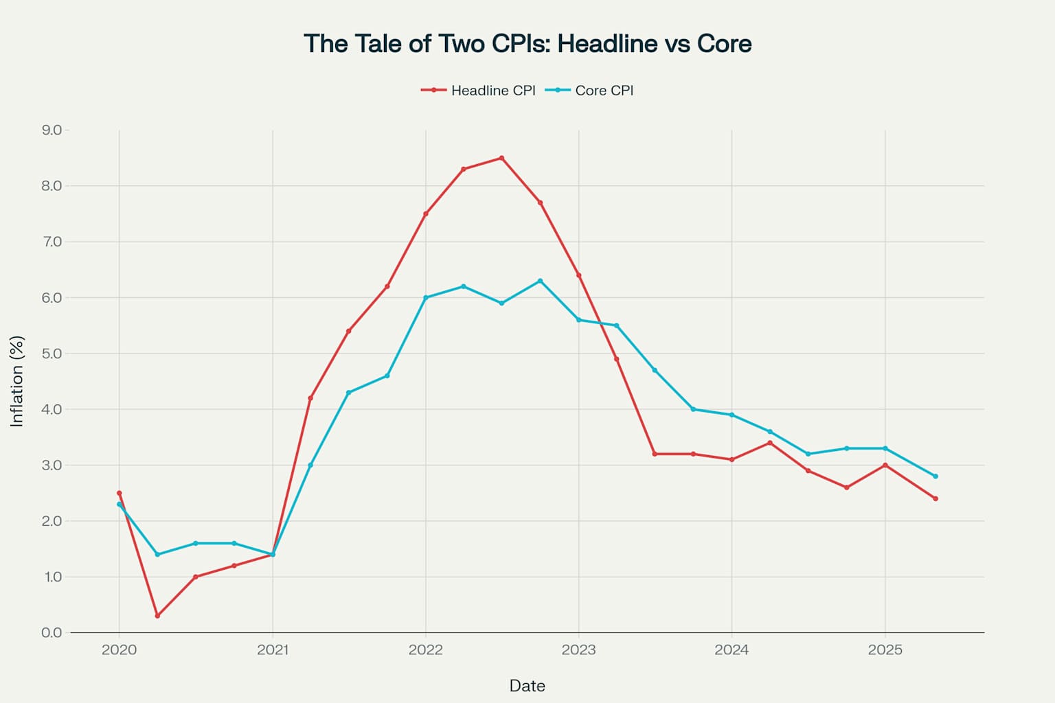
Headline CPI vs Core CPI: The difference between volatile headline inflation and more stable core inflation over the past 5 years.
You can see exactly what I mean in this chart—the red headline CPI line jumps around like it’s had too much caffeine, while the blue core CPI line maintains its composure like a seasoned economist at a dinner party .
Peeling Back the Layers: The Real Culprits Behind the Numbers
But looking at just two lines wasn’t enough for this investigation. To be a true CPI detective, I needed to examine the evidence inside the numbers. The CPI isn’t just one monolithic price—it’s made up of major categories, each with its own personality and economic story .
# Time to dig deeper - let's look at the troublemakers
categories = {
'Energy': 'CPIENGSL', # The wild child
'Shelter': 'CPIHOSSL', # The stubborn one
'Used Cars': 'CUSR0000SETA02', # The pandemic story (Corrected ID)
'Food at Home': 'CPIUFDSL' # The grocery bill shock
}
# Fetch data for each category starting from 2020 and add it to the DataFrame
print("\n🕵️♀️ Investigating the key categories...")
for name, series_id in categories.items():
inflation_data[name] = fred.get_series(series_id, observation_start='2020-01-01')
# Drop rows with any missing values that might have been introduced
inflation_data.dropna(inplace=True)
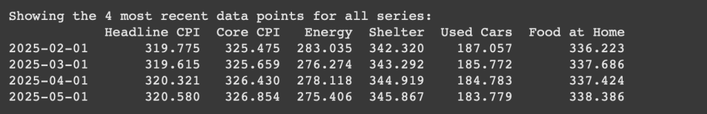
# Print the last 4 rows of the combined DataFrame
print("\nShowing the 4 most recent data points for all series:")
print(inflation_data.tail(4))
# Plotting the four new series
print("\n📊 Generating chart for key categories...")
plt.figure(figsize=(14, 7))
colors = {'Energy': 'green', 'Shelter': 'purple', 'Used Cars': 'orange', 'Food at Home': 'brown'}
for name in categories.keys():
plt.plot(inflation_data.index, inflation_data[name], label=name, color=colors[name])
plt.title('Key CPI Components (2020-Present)')
plt.xlabel('Date')
plt.ylabel('CPI Index (1982-84=100)')
plt.legend()
plt.grid(True)
plt.show()
print("\n✅ Investigation complete.")
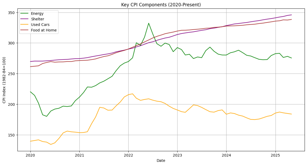
Energy: The Wild Child
Looking at the energy chart was like watching a financial roller coaster . Energy prices crashed during early COVID (remember when oil briefly went negative?), then rocketed up 30% year-over-year during 2021-2022, before settling down to a more reasonable 1% as of recent data . This is exactly why economists exclude energy from core CPI—it’s the category equivalent of that friend we all have who’s either extremely happy or devastatingly sad, with no emotional middle ground .
Shelter: The Stubborn One
The shelter category told a completely different story. While other categories were having their dramatic ups and downs, shelter costs just kept climbing steadily upward, currently sitting around 5% year-over-year growth. This is the inflation that really hurts because housing is the largest single expense for most people. It’s like that monthly bill that just keeps getting bigger, slowly but relentlessly, like a subscription service you forgot you could cancel .
Used Cars: The Pandemic Story
If energy was a roller coaster, used cars were a rocket ship followed by a parachute jump .Prices shot up over 40% year-over-year at one point during the pandemic (supply chains! stimulus checks! everyone suddenly needing personal transportation!), then crashed back down. Currently sitting at around 2.6% growth, it’s the category that best tells the story of our weird pandemic economy.
Food at Home: The Grocery Bill Reality Check
Food prices were the slow burn of inflation—not as dramatic as energy or used cars, but persistent enough to make every grocery trip feel like a small financial crime . Currently around 2% year-over-year, it’s the category that hits home every time you’re reaching for that overpriced box of cereal .
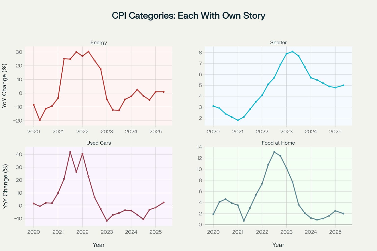
CPI Categories Breakdown: How different components of inflation tell their own unique economic stories
The Verdict: What My Python Investigation Revealed
After diving deep into the data, armed with nothing but curiosity and some Python code, here’s what I discovered:
That crazy $5.25 latte? It’s real, and it’s part of the “headline” drama that includes volatile food and energy prices . But the more persistent itch in my budget—the slow, steady creep of my rent—is the real story of “core” inflation. It’s the difference between the splashy, attention-grabbing price changes and the relentless, grinding increases that are harder to notice day-to-day but add up over time.
The Python analysis revealed that we’re living through multiple inflation stories simultaneously. There’s the volatile energy story (currently calm), the sticky housing story (still problematic), the recovering used car story (normalizing after pandemic weirdness), and the everyday grocery story (manageable but persistent) .
Most importantly, I learned that those scary inflation headlines are often capturing the most dramatic moment of a much more complex, nuanced story. When someone says “inflation is X%,” they’re giving you the headline number—which includes all the drama . The core number, the one that economists obsess over, is usually different and often more telling about long-term trends.