2. Understanding Portfolio Theory with Real-World Data and Python
Portfolio theory is a powerful framework that helps investors balance risk and return by constructing optimal portfolios. In this second post in the series portfolio management with Python, we’ll dive into its core ideas—diversification, correlation, and the Efficient Frontier—building on the basics from Post 1. Using Python and real-world stock data from Apple (AAPL), Microsoft (MSFT), and Amazon (AMZN), we’ll bring these concepts to life. By the end, you’ll not only grasp the theory but also see how to apply it practically to your own investments.
Key Concepts
Let’s start with the essentials of portfolio theory:
- Diversification: Think of this as the investing version of “don’t put all your eggs in one basket.” By spreading your money across different assets, you reduce the impact of any single asset’s poor performance. For example, if one stock tanks, others might hold steady or even rise, softening the blow.
- Correlation: This measures how two assets move together. A correlation of 1 means they move in perfect sync, while -1 means they move in opposite directions. For diversification to work best, you want assets with low or negative correlation—when one zigzags, the other might not follow.
- Efficient Frontier: Imagine a lineup of portfolios, each delivering the highest possible return for a specific level of risk. That’s the Efficient Frontier. It’s like a cheat sheet for picking the best portfolio for your risk tolerance, ensuring you’re not taking on extra risk without extra reward.
These ideas are the foundation of smart investing, and we’ll use real data to see them in action.
Step-by-Step Implementation
Let’s apply these concepts using historical stock data from AAPL, MSFT, and AMZN between January 1, 2022, and January 1, 2023. We’ll use Python with the yfinance library to fetch the data and analyze it.
Step 1: Fetching and Preparing the Data
First, we’ll grab the adjusted closing prices for our stocks and calculate their daily returns.
import yfinance as yf
import pandas as pd
import numpy as np
import matplotlib.pyplot as plt

# Define the stocks and time period
tickers = ['AAPL', 'MSFT', 'AMZN']
start_date = '2022-01-01'
end_date = '2023-01-01'

# Download adjusted closing prices
data = yf.download(tickers, start=start_date, end=end_date)['Close']

# Calculate daily returns
returns = data.pct_change().dropna()
Here, we’re downloading real prices and converting them into daily percentage changes (returns). This shows how each stock moves day-to-day, setting the stage for our analysis.
Step 2: Calculating Correlations
Next, we’ll check how these stocks move together by calculating their correlation matrix.
# Calculate correlation matrix
corr_matrix = returns.corr()
print("Correlation Matrix:\n", corr_matrix)
Below is the output:
Ticker
AAPL    1.000000  0.695904  0.824901
AMZN    0.695904  1.000000  0.741197
MSFT    0.824901  0.741197  1.000000
This matrix shows correlations between -1 and 1. For instance, AAPL and MSFT might have a correlation around 0.8, meaning they often move in the same direction but not perfectly. Lower correlations (e.g., closer to 0 or negative) would indicate better diversification potential.
Step 3: Simulating Multiple Portfolios
Now, let’s simulate 1,000 portfolios by assigning random weights to AAPL, MSFT, and AMZN. For each, we’ll calculate the expected return and risk (volatility).
# Number of portfolios to simulate
num_portfolios = 1000

# Initialize lists to store results
portfolio_returns = []
portfolio_vols = []
portfolio_weights = []

# Simulate portfolios
for _ in range(num_portfolios):
    # Generate random weights that sum to 1
    weights = np.random.random(len(tickers))
    weights /= weights.sum()
    portfolio_weights.append(weights)

    # Calculate annualized expected return
    port_return = np.sum(weights * returns.mean()) * 252

    # Calculate annualized volatility (risk)
    port_vol = np.sqrt(np.dot(weights.T, np.dot(returns.cov() * 252, weights)))

    portfolio_returns.append(port_return)
    portfolio_vols.append(port_vol)
Here’s what we’re doing:
- Weights: Randomly splitting our investment across the three stocks (e.g., 40% AAPL, 35% MSFT, 25% AMZN).
- Expected Return: The average annual return based on daily returns, scaled to a year (252 trading days).
- Volatility: The standard deviation of returns, annualized, representing risk.
Step 4: Plotting the Efficient Frontier
Finally, we’ll visualize these portfolios to spot the Efficient Frontier.
# Plot the simulated portfolios
plt.figure(figsize=(10, 6))
plt.scatter(portfolio_vols, portfolio_returns, c=np.array(portfolio_returns)/np.array(portfolio_vols), marker='o')
plt.title('Simulated Portfolios and Efficient Frontier')
plt.xlabel('Volatility (Risk)')
plt.ylabel('Expected Return')
plt.colorbar(label='Sharpe Ratio')  # Color by return per unit of risk
plt.show()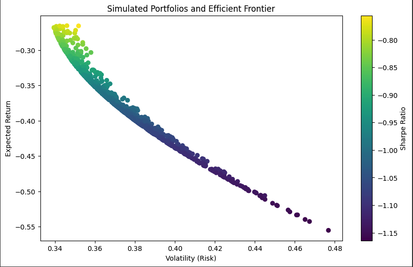
The result is a scatter plot where:
- Each dot is a portfolio.
- The x-axis shows risk (volatility).
- The y-axis shows expected return.
- The upper edge of the scatter cloud traces the Efficient Frontier—portfolios maximizing return for their risk level.
- Colors represent the Sharpe Ratio (return per unit of risk), with brighter colors indicating better risk-adjusted returns.
Identifying the Most Efficient Portfolio
Before we analyze the results, let’s calculate the Sharpe ratios for our 1,000 simulated portfolios and identify the most efficient one. The Sharpe ratio is a widely used metric in finance to evaluate the risk-adjusted return of a portfolio. It measures how much return you’re earning for each unit of risk taken, helping us find the portfolio that offers the best balance between reward and risk.
What Is the Sharpe Ratio?
The portfolio with the highest Sharpe ratio is considered the most efficient because it maximizes return per unit of risk.
Code for Calculating Sharpe Ratios and Finding the Optimal Portfolio
Here’s the Python code to compute the Sharpe ratios, identify the most efficient portfolio, and display its details:
# Calculate Sharpe ratios (assuming risk-free rate = 0)
sharpe_ratios = np.array(portfolio_returns) / np.array(portfolio_vols)

# Find the most efficient portfolio
optimal_idx = np.argmax(sharpe_ratios)
optimal_weights = portfolio_weights[optimal_idx]

# Print the most efficient portfolio
print("Most Efficient Portfolio:")
print(f"Weights - AAPL: {optimal_weights[0]:.2f}, MSFT: {optimal_weights[1]:.2f}, AMZN: {optimal_weights[2]:.2f}")
print(f"Expected Annual Return: {portfolio_returns[optimal_idx]:.4f}")
print(f"Volatility (Risk): {portfolio_vols[optimal_idx]:.4f}")
print(f"Sharpe Ratio: {sharpe_ratios[optimal_idx]:.4f}")
How the Code Works
- Sharpe Ratio Calculation: We divide each portfolio’s expected return (portfolio_returns) by its volatility (portfolio_vols) using NumPy arrays for efficiency. This gives us the Sharpe ratio for all 1,000 portfolios.
- Finding the Optimal Portfolio: The np.argmax() function locates the index of the portfolio with the highest Sharpe ratio, which we store in optimal_idx. We then extract its weights using portfolio_weights[optimal_idx].
- Displaying Results: The code prints the portfolio’s weights for AAPL, MSFT, and AMZN (formatted to 2 decimal places), along with its expected annual return, volatility, and Sharpe ratio (formatted to 4 decimal places for precision).
Output
Most Efficient Portfolio:
Weights - AAPL: 0.07, MSFT: 0.01, AMZN: 0.93
Expected Annual Return: -0.2666
Volatility (Risk): 0.3502
Sharpe Ratio: -0.7614
The Sharpe ratio measures how much return your portfolio earns for each unit of risk, compared to a risk-free rate (often assumed to be 0 in simulations like this). A positive Sharpe ratio means your portfolio earns more than the risk-free rate, while a negative Sharpe ratio means it’s underperforming that baseline—in our case, losing money.
The portfolio has an expected annual return of -26.66%, meaning it’s losing value. Negative Sharpe ratios are common during market downturns. When the return is negative, the Sharpe ratio will typically be negative because it reflects a loss rather than a gain per unit of risk. Here’s why this can happen and why it’s not unusual:
Understanding the Results
Running this code, you’ll see a pattern:
- Low-risk portfolios (left side): Lower volatility, but also lower returns.
- High-risk portfolios (right side): Higher volatility with potentially higher returns.
- Efficient Frontier: The top edge of the scatter plot highlights the best portfolios—those offering the most return for their risk.
Portfolios below the frontier are suboptimal; you could get a higher return for the same risk by picking a frontier portfolio. For example, a portfolio with 50% AAPL, 30% MSFT, and 20% AMZN might sit on the frontier, while a poorly balanced one might fall below.
Conclusion
Portfolio theory equips you to build smarter portfolios by balancing risk and return. With real data from AAPL, MSFT, and AMZN, we’ve seen how diversification reduces risk, correlation shapes asset relationships, and the Efficient Frontier guides optimal choices. Try running the Python code yourself—swap in your favorite stocks and experiment. In the next post, we’ll explore data analysis for portfolio management, digging deeper into financial data with Python.
Disclaimer: This content is for educational purposes only and should not be construed as financial advice. The portfolio example provided is based on historical data and simplified assumptions; it does not guarantee future performance. Investing involves risks, including the potential loss of principal. Always consult a qualified financial advisor before making any investment decisions