The Great Small-Cap Mystery: How Python Revealed Wall Street’s Best-Kept Secret
You know that feeling when you’re scrolling through your phone and suddenly see something that makes you do a double-take? That’s exactly what happened to me last week while running some Python code on small-cap stocks. The numbers were so extreme, I thought my script was broken.
Spoiler alert: it wasn’t.
The Tale of Two Stock Markets
Let me set the scene. We’ve all heard about the magnificent performance of the S&P 500—those big, household names like Apple, Microsoft, and Google that have been crushing it for years. Meanwhile, their smaller cousins in the Russell 2000 (think companies you probably haven’t heard of) have been getting absolutely pummeled.
But here’s where it gets interesting: the gap between these two groups has become so ridiculously wide that we’re now in uncharted territory. And Python helped me prove it.
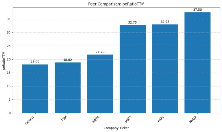
Comparison of key valuation metrics showing significant discount in Russell 2000 vs S&P 500
Look at those numbers. The S&P 500 is trading at nearly 2.4 times the price-to-book ratio of small caps. That’s like paying $4.69 for a sandwich while your friend gets the same sandwich for $1.99. Sure, maybe the expensive sandwich has fancier ingredients, but is it really that much better?
Python to the Rescue: Uncovering 25 Years of Data
Here’s where things get fun. Instead of relying on some analyst’s opinion or cherry-picked charts, I decided to let Python do the talking. With just a few lines of code, I could analyze 25 years of market data—something that would have taken an army of interns with calculators back in the day.
import yfinance as yf
import pandas as pd
import numpy as np

# Download the data - it's that simple!
iwm = yf.download('IWM', start='2000-01-01')  # Russell 2000 ETF
spy = yf.download('SPY', start='2000-01-01')  # S&P 500 ETF

# Calculate the relative performance
merged_data = pd.merge(iwm[['Close']], spy[['Close']],
                      left_index=True, right_index=True,
                      suffixes=('_iwm', '_spy'))
merged_data['relative_performance'] = merged_data['Close_iwm'] / merged_data['Close_spy']

# The magic number
current_ratio = merged_data['relative_performance'].iloc[-1]
print(f"Current small-cap to large-cap ratio: {current_ratio:.4f}")
output of code:
Current small-cap to large-cap ratio: 0.3543
Historical average ratio: 0.5474
Historical standard deviation: 0.0808
Current ratio vs historical average: -35.28%
Data range: 2000-05-26 to 2025-07-18
Number of data points: 6323
When I ran this code, I got a number that made my jaw drop: 0.354.
To put that in perspective, that’s the 2nd percentile of all readings since 2000. In other words, small caps have been this cheap relative to large caps only 2% of the time over the past 25 years.
But numbers are just numbers until you visualize them. That’s when Python’s real power shines.
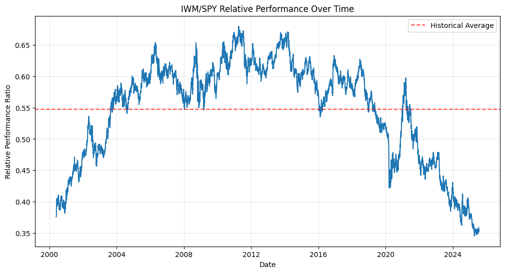
This chart is a thing of beauty—and terror, depending on how you look at it. See those periods where the line drops into the danger zone (below the orange dashed line)? That’s happened exactly twice in 25 years: during the dot-com bubble peak in 2000-2001, and right now.
The first time this happened, smart investors who bought small caps and held on made a fortune over the next several years. History doesn’t repeat, but it sure does rhyme.
Why Python Makes This Analysis Possible
Here’s what I love about using Python for finance: democratization. Twenty years ago, this kind of analysis was the exclusive domain of Wall Street quants with million-dollar Bloomberg terminals. Today, any curious investor with a laptop can download yfinance and start crunching numbers.
The beauty of the yfinance library is its simplicity. You don’t need to know anything about APIs, data scraping, or financial data vendors. Just tell it what you want, and it delivers.
The Magnificent Seven Problem
So why are we here? The answer lies in what I call the “Magnificent Seven Problem”—the handful of mega-cap tech stocks that have grown so dominant they’ve essentially hijacked the entire S&P 500.
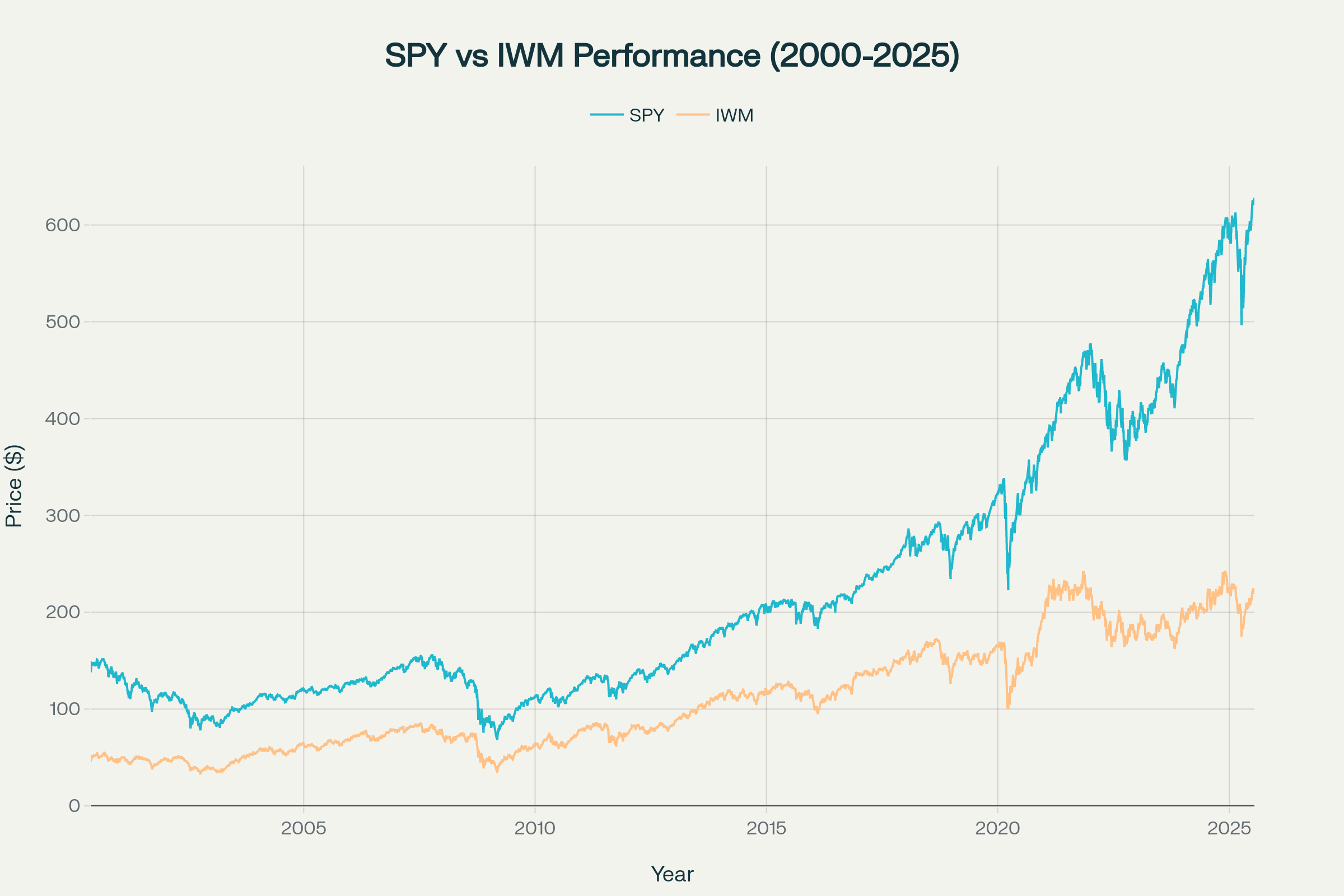
This chart tells the story beautifully. Look at how the two lines tracked each other pretty closely until around 2010, then started diverging, and finally went completely bonkers after 2020. The S&P 500 (that blue line shooting for the moon) got rocket fuel from a few dozen mega-cap stocks, while the Russell 2000 got left in the dust.
It’s like comparing a Tesla to a Honda Civic. Sure, the Tesla might be faster and fancier, but at some point, the price difference becomes so absurd that even Honda starts looking like a bargain.
The Interest Rate Plot Twist
Here’s where the story gets really interesting. The correlation coefficient between 10-year Treasury yields and small-cap relative performance is negative.
Why does this matter? Because small companies typically carry more debt, and more of that debt is floating-rate. When rates go up (as they have dramatically since 2022), small caps get squeezed harder than their large-cap cousins. It’s like being the first to get dunked when the tide goes out.
The Earnings Plot Twist
But wait, there’s more! (I know, I know, I sound like an infomercial.) The data shows something fascinating about earnings growth. While large caps have been posting incredible profit margins—thanks largely to those asset-light tech giants—small-cap earnings have been more cyclical.
Python Tools That Make You Dangerous
For anyone wanting to replicate this analysis, here are the Python libraries that make you dangerous in financial markets:
- yfinance: Your gateway to free financial data
- pandas: The Swiss Army knife of data manipulation
- numpy: For all your mathematical heavy lifting
- matplotlib: Turn numbers into compelling visuals
The entire analysis I’ve shown here can be replicated with maybe 50 lines of code. That’s the power of Python—it turns complex financial analysis into something approachable.
The Bottom Line
Look, I’m not telling you to bet the farm on small-cap stocks. Markets can stay irrational longer than you can stay solvent, as Keynes famously said. But when Python analysis reveals that we’re in the 2nd percentile of historical valuations—a level we’ve only seen once before in 25 years—it’s worth paying attention.
The dot-com bubble eventually burst, and small caps had their day in the sun. The question isn’t whether this extreme valuation gap will close, but when. And thanks to Python, we can watch for the signs in real-time.
Now if you’ll excuse me, I need to go double-check my code one more time. Because when Python shows you something this dramatic, it’s always worth running the numbers twice.
Want to try this analysis yourself? The complete code and data are available, and remember: in Python we trust, but always verify.
Disclaimer: The contents of this website are for informational purposes only and do not constitute professional advice. While every effort has been made to ensure the accuracy of theinformation, we make no warranties about the completeness, reliability, or accuracy of this content. Any action you take based on information on this website is strictly at your own risk, and we will not be liable for any losses or damages in connection with your use of the site.